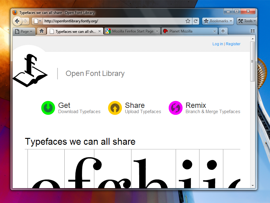
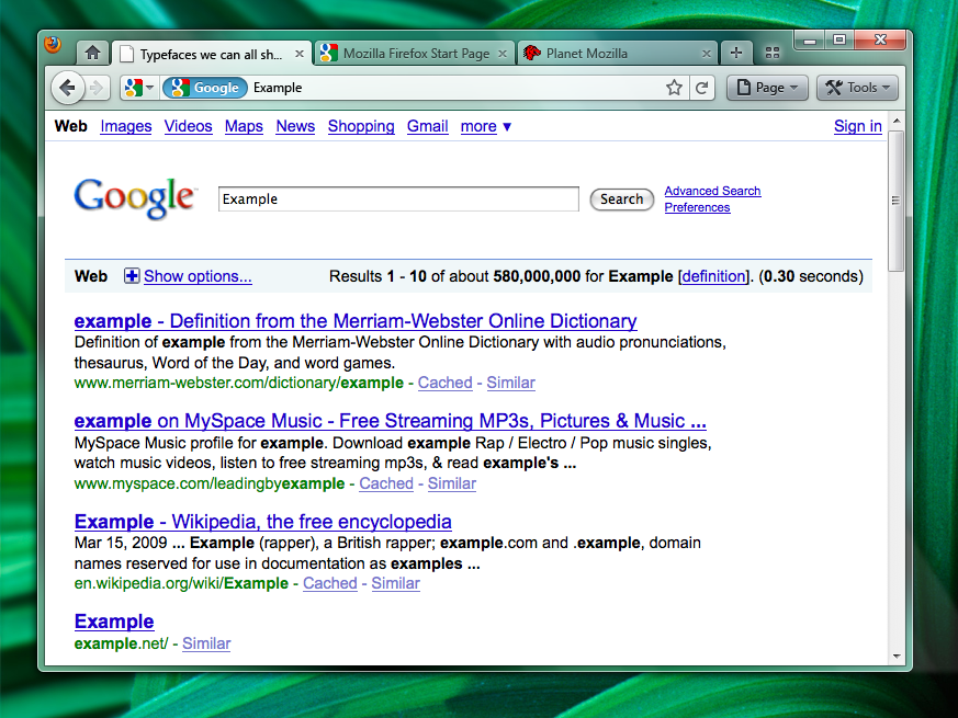
Excited for the proposed looks of Firefox 3.7? If that excitement is already dying for you, look no further than the newest mockups for Firefox 4.0!

There's the good old Tabs on Bottom look to be similar with all the previous versions of Firefox, but you can also see a version with tabs on the top. Though this design lacks a proper title and the lost familiarity of the program might confuse people.
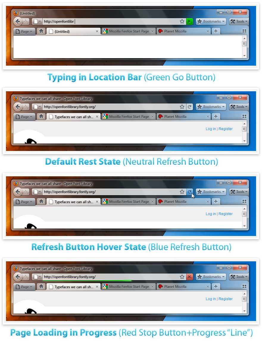
Below is an image that shows ideas for the Go/Refresh/Stop/Progress Line. As the GUI of Firefox will generally be achromatic, the sharp colours of the buttons are intended to show users that something's going on. Plus, there is also a Bookmarks widget that was proposed to get rid of the Bookmarks Menu/Bar.Though those can be re-enabled by the user, these were intended to save even more space. Though it does seem that it would be better off with no test, along with the other two dropdown buttons. What do you think?
Labels
- 300MB Movie Section (4)
- Audio Albums (7)
- Entertainment Newz (5)
- Games (3)
- geeks (7)
- Jokes (1)
- Microsoft (3)
- Movies (18)
- SriLankan Artist (1)
- UpComing Events (5)
Blog Archive
-
▼
2009
(76)
-
▼
August
(9)
- Microsoft Office 2010 build 14044171000 Screenshot...
- Mininova Next-on Hitlist ordered to remove infring...
- Intel Announces core i7 Mobile centrino 2 Availabi...
- Project Natal To Ship late next year[X box 360]
- Firefox 4.0 Mockups Released
- The unseen evolution of the Windows 7 Taskbar
- Sri Lankan Film Julia Released - Pictures- Trailer...
- G.I.JOE (2009) New – STG-FATAL – TS [400MB]
- Terminator Salvations (2009) – R5
-
▼
August
(9)


0 comments:
Post a Comment